Typography
Used together, these three typefaces create a clear hierarchy while making our content legible and engaging.
Sofia Pro
Sofia Pro is our sans-serif face, and the workhorse of our typography collection. As pragmatic as it is friendly, Sofia is suited for headlines, subheads, body copy and captions. However, the Black, UltraLight and ExtraLight weights of the font work best in headlines, while the middle weights are better for body copy and captions.

Additional weights


Font Substitute
Our brand fonts may not always be available for use in Word documents, PowerPoint presentations and other digital applications. This page offers appropriate substitutes.
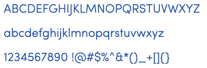
Arial or Trebuchet MS
More Pro
The More Pro family contains our serif faces. The angles and curves of the character set creates a dynamic and modern font that can serve as a support or foil for Sofia. While its primary use is for longer-form copy and smaller captions, More can also add an air of sophistication and prestige when it’s chosen for headlines.

Additional weights


Font Substitute
Our brand fonts may not always be available for use in Word documents, PowerPoint presentations and other digital applications. This page offers appropriate substitutes.
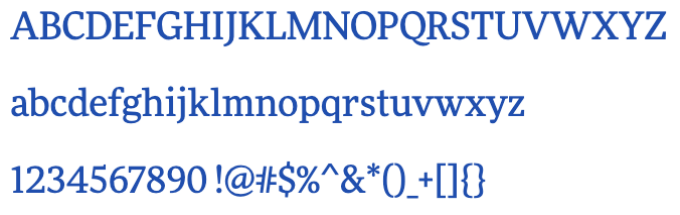
Georgia
Freeland
Freeland is an energetic and welcoming handwriting font. It should be used sparingly—only in headlines—to emphasize a single word. No more than one word per layout should be set in Freeland. The “Here is how” lockups are a perfect example of Freeland’s use. Overuse can result in illegibility.


Font Substitute
Freeland is a display face with a lot of personality. There’s no appropriate alternative.